Asciidoctor PDF - Admonition icons are bold

Previous Topic Next Topic
 
classic Classic list List threaded Threaded
3 messages Options
Reply | Threaded
Open this post in threaded view
|

Asciidoctor PDF - Admonition icons are bold

MonaElsa
This post was updated on .
Since I use asciidoctorj-pdf-1.5.0-alpha.17 the admonition icons are displayed different. These are more bold.

How can I display the icons in normal font style?


Admoniton icons with asciidoctorj-pdf-1.5.0-alpha.16:
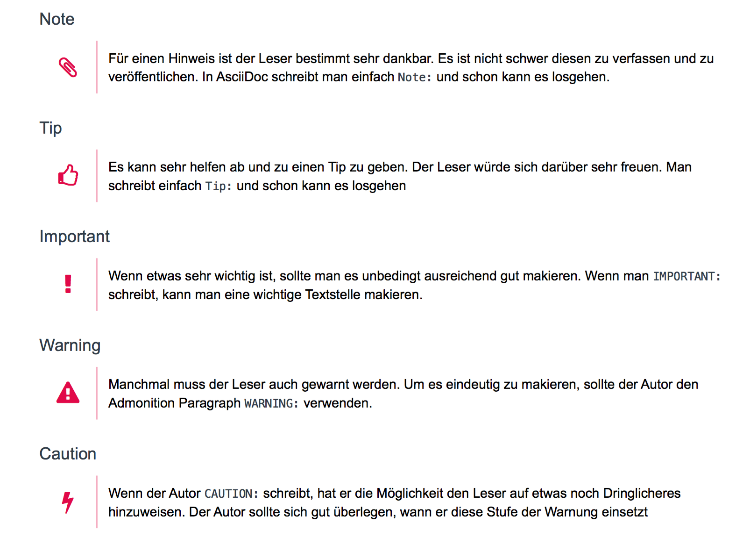
Admoniton icons with asciidoctorj-pdf-1.5.0-alpha.16


Admoniton icons with asciidoctorj-pdf-1.5.0-alpha.17:
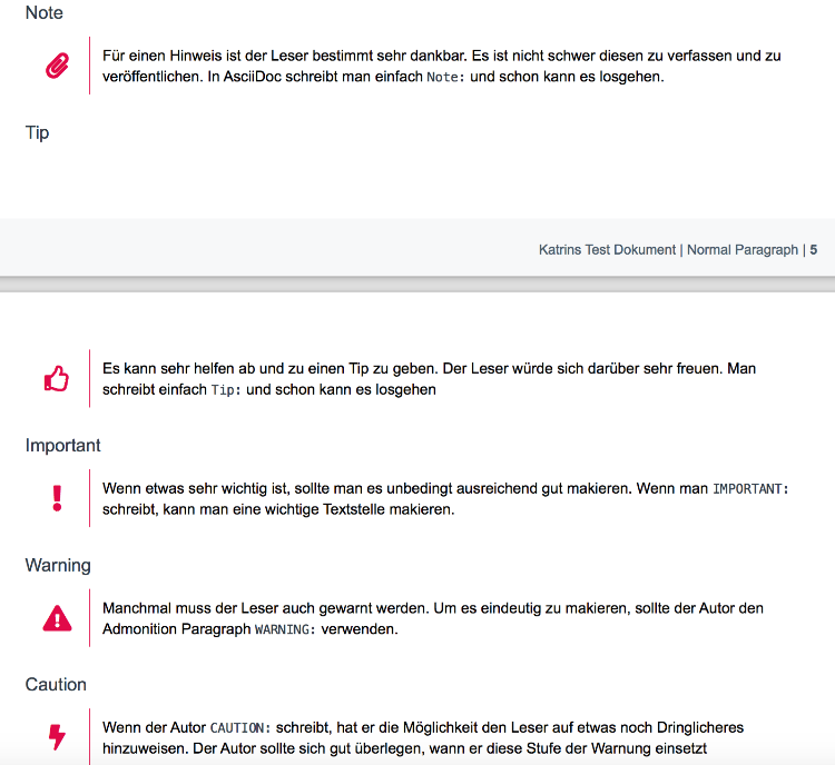
Admonition icons with asciidoctorj-pdf-1.5.0-alpha.17
Reply | Threaded
Open this post in threaded view
|

Re: Asciidoctor PDF - Admonition icons are bold

mojavelinux
Administrator
Asciidoctor PDF has made the switch to Font Awesome 5. What you've shown is just the way the icons look in Font Awesome 5. The style has evolved.

See https://fontawesome.com/icons?d=3Dgallery&q=3Dinfo-circle

If you don't like those icons, you could chose an icon from a different set. Here's an example of a theme file that uses the info icon from Foundation icons instead:

extends:
- default
admonition:
  icon:
    note:
      name: fi-info

Here's the foundation icon list: https://zurb.com/playground/foundation-icon-fonts-3

(You could also just pick a different icon in the Font Awesome set that is less bold).

Cheers,

-Dan
Reply | Threaded
Open this post in threaded view
|

Re: Asciidoctor PDF - Admonition icons are bold

MonaElsa
Thank you for the prompt reply! Now I understand.